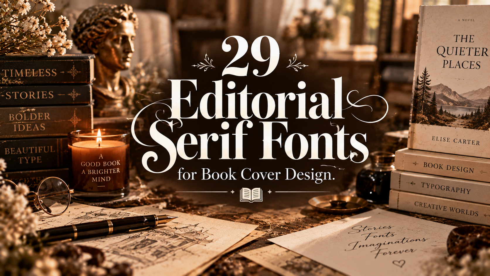
29 Editorial Serif Fonts for Book Cover Design
Editorial Serif Fonts can give book covers a refined and sophisticated look while creating a strong visual hierarchy for titles and supporting text. In this guide, we’ve collected 29 editorial serif fonts for book covers, magazine layouts, literary projects, posters, branding and other typography-focused designs. From classic high-contrast serifs to modern and expressive styles, each font brings a distinctive character that can help your cover feel polished, timeless and visually compelling.

Editorial & Book Typography
Discover 29 elegant editorial serif fonts for book covers, novels, literary publications, magazines, titles, and sophisticated print design. From refined classic serifs to contemporary editorial styles, these fonts can give your typography a polished and memorable presence.
A great book cover often starts with typography. Editorial serif fonts can create a sense of authority, sophistication, literary character, and timelessness. The key is choosing a typeface whose proportions, contrast, and personality support the genre and message of the book.
How to Choose an Editorial Serif Font
When choosing a serif font for a book cover, think about genre first. A high-contrast elegant serif can work beautifully for romance, fashion, literary fiction, or lifestyle titles, while a sturdier serif can feel more traditional and authoritative.
Pay attention to the title length as well. Fonts with distinctive capitals can be excellent for short book titles, while more balanced and readable serif families are useful when a cover contains a longer subtitle or author name.
29 Editorial Serif Fonts for Book Cover Design
Here are 29 editorial serif fonts with different personalities, from elegant fashion-inspired styles to classic literary serifs and contemporary magazine typography.

01 · Editorial Serif
Rosemode
Rosemode brings an elegant editorial personality to book-cover typography. Its refined character can work especially well for titles that need a polished, fashion-forward, or sophisticated visual identity.
02 · Elegant Serif
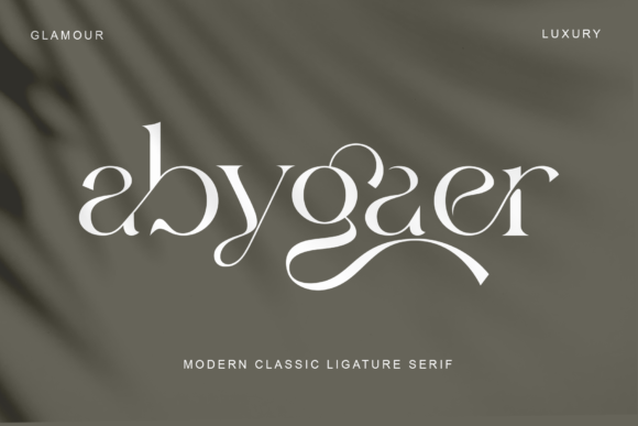
Abygaer
Abygaer is a graceful serif option for covers that need a sophisticated and polished appearance. Its editorial direction can help a title feel elevated without becoming overly decorative.

03 · Artistic Serif
White Chalk
White Chalk offers a more expressive direction for editorial typography. It can be useful when a book cover needs a distinctive handmade or artistic quality alongside its serif-inspired structure.

04 · Modern Serif
Kodam
Kodam provides a contemporary serif direction for modern editorial layouts. It can give book titles a structured and confident appearance while retaining the visual warmth associated with serif typography.
05 · Editorial Display Serif
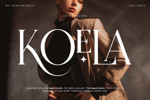
Koela
Koela has an editorial feel that can make short titles stand out on a sophisticated book cover. It is particularly useful when the typography needs to become a strong part of the visual composition.

06 · Classic Editorial
Analogist
Analogist combines an editorial sensibility with a classic typographic feel. It can be a strong choice for covers that need to communicate intelligence, culture, or literary depth.
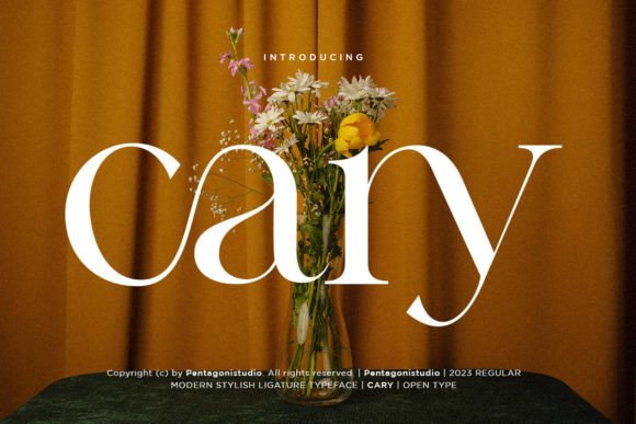
07 · Refined Serif
Cary
Cary is a refined serif option for book covers where clean proportions and elegant lettering are important. It can support both traditional and modern editorial compositions.

08 · Contemporary Serif
Qaligo
Qaligo offers a contemporary editorial direction that can give a book title a distinctive and stylish presence. It works well when traditional serif structure needs a modern visual attitude.

09 · Editorial Serif
Motesar
Motesar is suited to editorial compositions that require a confident serif presence. Its character can help create hierarchy between the main title, subtitle, and author name.

10 · Stylish Serif
Holipop
Holipop adds a stylish personality to serif typography. It can be especially effective for covers that need a balance between editorial sophistication and a more distinctive visual voice.

11 · Modern Editorial
Bosento
Bosento works well for contemporary editorial layouts where typography needs to feel polished and intentional. It can create a strong title without overwhelming the rest of the cover.

12 · Elegant Serif
Medona
Medona brings a polished and elegant serif character to display typography. It can help create a premium appearance for titles that need sophistication and visual refinement.

13 · Literary Serif
Inword
Inword is a natural fit for editorial and literary typography. Its serif character can give book covers a thoughtful, established, and publication-ready appearance.

14 · Editorial Display
Ladinta
Ladinta offers an editorial display direction that can make short book titles visually memorable. It is useful for covers where typography needs to provide both structure and personality.

15 · Modern Serif
Balgind Modern Serif
Balgind Modern Serif combines classic serif structure with a contemporary editorial attitude. It is particularly useful for modern covers that need typography to feel sophisticated but current.

16 · Refined Editorial Serif
Lebora
Lebora is a polished serif choice for book covers that benefit from an elegant editorial tone. It can work well as both a title font and a supporting typographic element.

17 · Editorial Serif
Mickore
Mickore provides a stylish serif direction for editorial compositions. Its visual personality can help a cover feel carefully designed while keeping the title at the center of attention.

18 · Elegant Serif
Galime
Galime is suited to sophisticated editorial typography where elegant letter shapes can become part of the overall visual identity of the cover.

19 · Strong Editorial Serif
Denali
Denali offers a confident serif personality that can provide strong visual structure on a book cover. It is useful when the title needs to feel clear, established, and intentional.

20 · Classic Editorial
Julane
Julane brings a graceful classic feeling to serif typography. It can work particularly well when a book cover needs a timeless rather than highly experimental appearance.

21 · Modern Editorial Serif
Wegina
Wegina is a versatile serif choice for modern editorial compositions. It can create a polished hierarchy when combined with a smaller subtitle or clean supporting typeface.

22 · Magazine Serif
Magazine
Magazine is an obvious choice for editorial-inspired typography. Its name reflects the type of visual context where this style can be especially useful: headlines, covers, and sophisticated publication design.
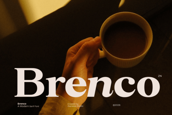
23 · Editorial Serif
Brenco
Brenco is a versatile serif for clean editorial layouts. It can give book titles a professional appearance while leaving enough visual space for photography, illustration, or other cover elements.

24 · Editorial Serif
Editorium Serif
Editorium Serif is designed with editorial typography in mind, making it a natural candidate for book covers and publication-focused layouts. It can help create a polished literary atmosphere.

25 · Fashion Editorial
The Avenue Editorial
The Avenue Editorial has a sophisticated publication-inspired direction. It is especially suited to covers where fashion, lifestyle, culture, or premium editorial aesthetics are important.

26 · Contemporary Editorial
The Stripes Editorial
The Stripes Editorial brings a more distinctive visual personality to editorial typography. It can help a book cover feel contemporary and fashion-conscious while maintaining a strong typographic hierarchy.

27 · Classic Serif
Grandeur – Elegant Classic Serif
Grandeur is a classic serif choice for covers that need a sense of elegance and permanence. Its traditional direction can work beautifully for literary and premium publishing projects.

28 · Editorial Style
Editorial Style
Editorial Style is a natural fit for designers looking for typography with a publication-inspired personality. It can help create a professional and fashion-forward visual hierarchy on a book cover.

29 · Sophisticated Serif
Solaris Serif
Solaris Serif rounds out the collection with a sophisticated editorial personality. It can be used to create a polished title treatment while retaining the classic authority of serif typography.
How to Use Serif Fonts on Book Covers
1. Start with the genre. Match the personality of the serif to the book. Elegant high-contrast styles can suit romance and fashion, while stronger traditional serifs can work well for history, nonfiction, and literary titles.
2. Make the title the hero. A book cover usually needs a clear typographic hierarchy. Give the main title the strongest size or weight and keep supporting information secondary.
3. Pay attention to contrast. Editorial covers often benefit from contrast between large display lettering and smaller supporting typography.
4. Pair serif with a simple sans serif. A sophisticated serif title can be balanced with a clean sans serif for the author name, subtitle, or additional information.
5. Test the cover at thumbnail size. Your typography should remain recognizable when the cover is viewed small on an online bookstore or social media feed.
Best Editorial Serif Fonts by Style
Elegant & Luxury
For premium and sophisticated covers, consider Rosemode, Medona, Galime, Lebora, and Grandeur.
Classic & Literary
For traditional literary projects, Analogist, Inword, Julane, Denali, and Solaris Serif are strong options.
Modern & Contemporary
For modern editorial covers, look at Kodam, Qaligo, Balgind Modern Serif, Wegina, and Brenco.
Fashion & Magazine Inspired
For fashion-forward book covers and editorial layouts, consider Magazine, The Avenue Editorial, The Stripes Editorial, and Editorial Style.
Distinctive Editorial Display
If you want the title itself to become a major visual element, explore Koela, Ladinta, Motesar, and Holipop.
FAQ About Editorial Serif Fonts
What is an editorial serif font?
An editorial serif font is a serif typeface with a polished, publication-ready personality often associated with books, magazines, fashion, culture, and premium print design. These fonts can range from classic literary styles to contemporary display serifs.
Are serif fonts good for book covers?
Yes. Serif fonts are widely useful for book covers because they can communicate literary character, sophistication, tradition, and authority. The best choice depends on the genre and the visual direction of the cover.
Which serif fonts work well for romance book covers?
Elegant styles such as Rosemode, Medona, Galime, Lebora, Grandeur, and Julane can be good starting points for romance covers where refined typography is part of the visual identity.
What serif font is best for a literary book cover?
Literary covers often benefit from balanced and sophisticated serif styles. Analogist, Inword, Denali, Julane, and Solaris Serif are useful options to explore depending on the tone of the book.
Can I pair an editorial serif with a sans serif?
Absolutely. A common approach is to use the editorial serif for the main title and a clean sans serif for the author name, subtitle, or supporting information. This creates contrast while keeping the hierarchy easy to understand.
How do I make a book cover look more editorial?
Use strong typographic hierarchy, generous spacing, restrained colors, and carefully chosen imagery. A sophisticated serif paired with a simple supporting typeface can create a polished editorial effect without making the cover feel overcrowded.
You may also like:
- 18 Elegant Premium Fonts for Fashion & Luxury Branding 2026
- 19 Best Art Deco Fonts for Luxury Branding and Fashion Design
- 26 Best Editorial Serif Fonts for Print & Magazine Design
- 20 Premium Serif Fonts for Fashion Branding & Editorials
- 15 Elegant Luxury Fonts for Beauty Branding
- 16 Elegant Fonts for Luxury Clothing Labels 2026