17 Best Gothic Fonts for Fantasy Map Designs
Gothic Fonts can instantly give fantasy maps a mysterious, ancient and immersive character, making them a natural choice for fictional worlds and storytelling projects. In this guide, we’ve collected 17 Gothic fonts for fantasy maps, game designs, book covers, titles, labels, posters and other imaginative projects. From intricate medieval-inspired lettering to dramatic Gothic display styles, each font brings a distinctive atmosphere that can make your fantasy designs feel more authentic and captivating.

Fantasy Typography
Discover gothic, blackletter and medieval-inspired fonts that bring ancient kingdoms, forgotten realms and dark fantasy worlds to life. These typefaces are ideal for fantasy maps, RPG projects, fictional histories, game worlds and atmospheric titles.
Why gothic fonts work so well for fantasy maps: Gothic and blackletter typography immediately suggests medieval manuscripts, ancient kingdoms, castles, legends and mysterious worlds. The right display font can make even a simple map feel like an artifact from another age.
17 Gothic Fonts for Fantasy Maps
From traditional Old English lettering to darker blackletter styles, these fonts offer plenty of options for labeling kingdoms, regions, cities, landmarks and fantasy titles.
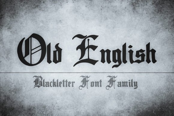
01 · Traditional Blackletter
Old English
Old English is a classic blackletter choice for fantasy maps that need a strong medieval atmosphere. Its historic character makes it especially effective for major kingdom names, ancient territories and prominent map headings.

02 · Dark Gothic
Nightmare Gothic
Nightmare Gothic brings a darker and more dramatic personality to fantasy typography. It works particularly well when your map belongs to a mysterious, dangerous or supernatural world.
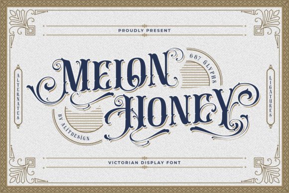
03 · Decorative Gothic
Melon Honey
Melon Honey offers a decorative display personality that can add charm and individuality to a fantasy setting. Use it selectively for important locations, decorative headings or a more stylized map aesthetic.

04 · Ornamental Gothic
Tattoo Studio
Tattoo Studio has an expressive, ornamental feel that can give fantasy cartography a handcrafted appearance. It is a strong option for titles and distinctive map elements rather than dense body labels.
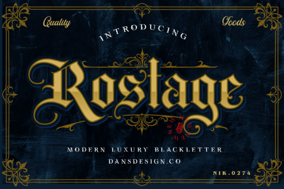
05 · Medieval Display
Rostage
Rostage brings a bold display presence that fits medieval-inspired fantasy projects. Its strong character makes it useful when you want important names to stand out from the surrounding cartographic details.
06 · Medieval Display
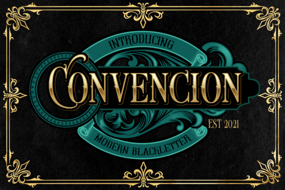
Convencion
Convencion adds a distinctive historical mood to fantasy typography. Its display character is suited to prominent names and atmospheric map elements where personality matters more than compact readability.

07 · Classic Gothic
Cambridge
Cambridge gives fantasy projects a traditional, scholarly quality. It can work especially well when the fictional world is presented as an old manuscript, historical record or carefully illustrated atlas.
08 · Bold Gothic
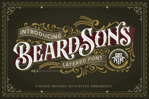
Beardsons
Beardsons offers a bold display look for fantasy designs that need a stronger, more assertive typographic voice. It can help major locations and headings command attention without requiring additional decorative elements.

09 · Decorative Blackletter
Brellos
Brellos has a decorative presence that can give a fantasy map a polished, illustrated feel. It is especially useful for large names and special locations that deserve visual emphasis.
10 · Fantasy Display
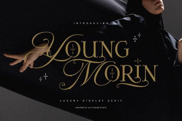
Young Morin
Young Morin can add personality to fictional worlds without relying entirely on a traditional blackletter appearance. Use it for selected labels where you want the map to feel expressive and characterful.

11 · Dark Blackletter
Grimoire Noir
Grimoire Noir has an appropriately mysterious name and a dark display personality. It is a natural choice for fantasy maps inspired by spellbooks, forbidden knowledge and shadowy realms.

12 · Blackletter
Midnight Blackletter
Midnight Blackletter is well suited to fantasy settings with a darker, nocturnal atmosphere. Its blackletter character can create an old-world feeling for important names and dramatic map titles.

13 · Medieval Display
The Centurion
The Centurion has a commanding name and a strong display-oriented character. It can help establish hierarchy on maps where empires, military territories or important settlements need to feel significant.

14 · Dark Gothic
Blackrend
Blackrend is a strong fit for maps that lean into a darker fantasy aesthetic. Its dramatic character can be used to emphasize ominous locations, hostile territories and powerful names.

15 · Classic Blackletter
Archdale Blackletter
Archdale Blackletter delivers a distinctly traditional look for fantasy cartography. It can work beautifully when your design references medieval manuscripts, heraldry and old-world typography.
16 · Old English
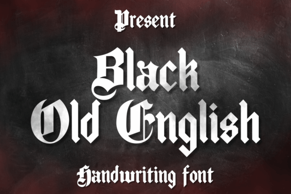
Black Old English
Black Old English is a natural choice when you want unmistakable medieval character. Its strong historical feel makes it especially effective for major map titles, royal territories and ancient fantasy civilizations.

17 · Gothic Display
Wednesday
Wednesday brings a gothic display mood that can give fantasy maps a darker, contemporary edge. It is particularly useful when the world combines medieval themes with a mysterious or macabre atmosphere.
How to Use Gothic Fonts in Fantasy Map Design
Gothic fonts work best when they are treated as display typography rather than used for every piece of information on the map. A strong hierarchy helps the map remain atmospheric while still being easy to navigate.
1. Reserve the strongest font for major names
Use your most decorative gothic typeface for the map title, major kingdoms, empires or other important locations. This creates an immediate visual hierarchy.
2. Keep smaller labels readable
Highly decorative blackletter can become difficult to read at small sizes. Pair the main gothic font with a simpler serif or sans-serif for roads, rivers, minor settlements and supporting information.
3. Create a clear hierarchy
Different sizes, weights and spacing can distinguish continents, kingdoms, cities, villages and landmarks. You do not need a different font for every category.
4. Match the font to the world
Traditional Old English styles suit medieval kingdoms, while darker gothic fonts are excellent for cursed lands, haunted regions and supernatural fantasy settings.
5. Think about texture and atmosphere
A fantasy map is more than a collection of labels. Consider how the typography interacts with parchment textures, illustrated borders, compass roses and other visual details.
Best Gothic Fonts by Style
Best for traditional medieval maps: Old English, Cambridge and Black Old English.
Best for dark fantasy worlds: Nightmare Gothic, Grimoire Noir, Midnight Blackletter and Blackrend.
Best for bold fantasy titles: Beardsons, Rostage and The Centurion.
Best for decorative fantasy maps: Melon Honey, Tattoo Studio and Brellos.
Best for classic blackletter aesthetics: Archdale Blackletter and Black Old English.
Best for gothic atmosphere: Wednesday and Nightmare Gothic.
FAQ: Gothic Fonts for Fantasy Maps
What font style is best for a fantasy map?
Gothic, blackletter, Old English and medieval-inspired display fonts are popular choices because they immediately create an old-world atmosphere. The best option depends on whether your world feels historical, magical, dark or whimsical.
Are blackletter fonts easy to read on maps?
They can be very readable at larger sizes, but highly decorative blackletter styles may become difficult to read when used for tiny labels. For detailed maps, reserve blackletter for major names and pair it with a simpler supporting typeface.
Can gothic fonts be used for RPG maps?
Absolutely. Gothic fonts are particularly effective for tabletop RPG maps, fantasy game worlds, fictional kingdoms, dungeon settings and campaign materials.
Should every label on a fantasy map use the same font?
Not necessarily. A strong primary font combined with a readable secondary font usually creates better hierarchy and makes the map easier to understand.
What should I pair with a gothic font?
A classic serif or clean sans-serif can make an excellent companion. Use the gothic font for important names and the simpler typeface for supporting labels and smaller information.
Can these fonts work for fantasy book projects too?
Yes. Many of these styles can also work for fantasy book covers, chapter titles, fictional documents, game logos, posters and other worldbuilding materials.
You may also like:


One Comment