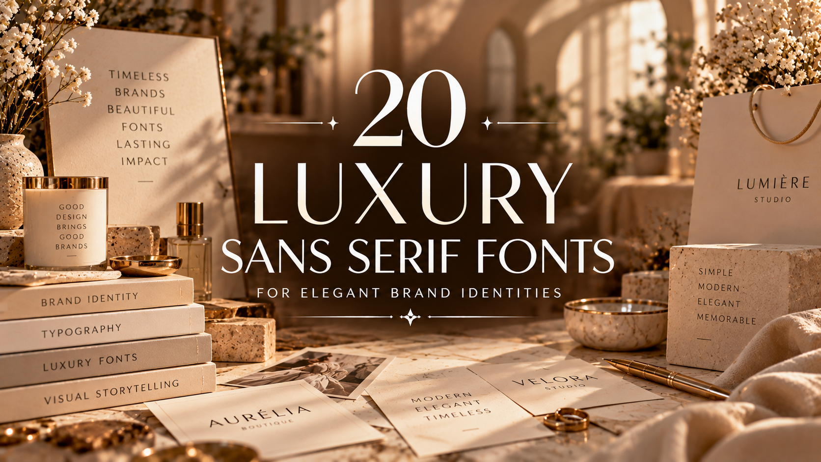
20 Luxury Sans Serif Fonts for Elegant Brand Identities
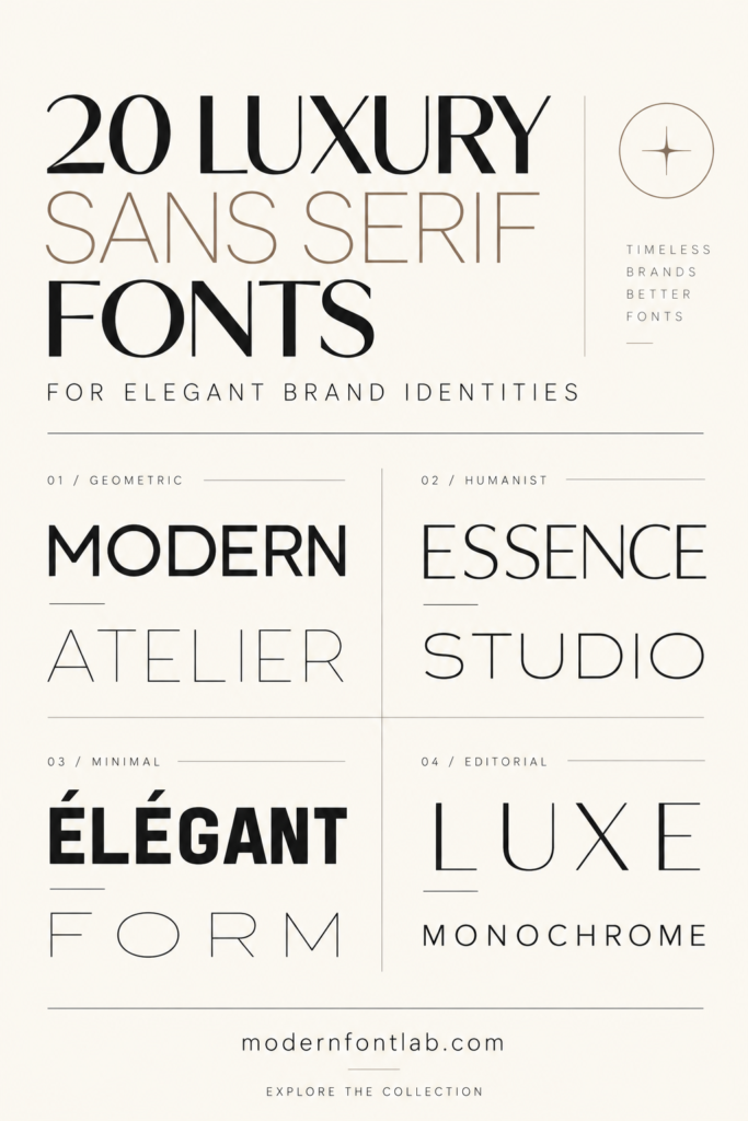
The right typography can transform a brand’s visual identity. Whether you’re designing a premium logo, elegant packaging, a fashion label, or a sophisticated website, a carefully selected sans serif font can help create a polished and memorable look.
In this collection, you’ll discover 20 fonts to explore for luxury-inspired branding, modern editorial layouts, beauty businesses, lifestyle projects, and creative identities. From refined minimalism to bold contemporary styles, these options can help you find a typographic direction that suits your next design.
20 Luxury Sans Serif Fonts to Explore
Browse the fonts below and visit each listing to preview its characters, check the available styles and file formats, and review the license before using it in your branding projects.

1. Glavoire Font
Explore Glavoire as a starting point for a refined visual identity. Consider how its letterforms could work across logo concepts, editorial designs, and premium brand materials.
Explore Glavoire
2. Savora Font
Consider Savora for a brand concept that needs a considered typographic style. Preview the lettering in your intended logo, headings, and promotional materials.
Explore Savora
3. Highfield Font
Highfield is another option to investigate when developing a cohesive brand identity. Test it in large headlines, logo drafts, and supporting text to see where it works best.
Explore Highfield
4. Falore Font
Explore Falore for creative branding concepts and polished visual layouts. Compare its appearance at different sizes before choosing it for a complete identity system.
Explore Falore
5. Barium Font
Barium is worth previewing for modern design projects. Try it in a brand name, website heading, or packaging mockup to assess its overall visual impact.
Explore Barium
6. Caveline Font
Discover Caveline as another candidate for a polished typographic identity. Test it with your brand colors and visual assets to see whether the combination feels consistent.
Explore Caveline
7. Orviele Font
Consider Orviele when comparing font options for logos, campaign graphics, and editorial layouts. Preview the actual glyphs and included characters on the product page.
Explore Orviele
8. Avery Font
Avery gives you another option to evaluate for a brand refresh or new creative project. Try the font in both a short brand name and longer text to compare readability.
Explore Avery
9. Maldives Font
Preview Maldives in branding mockups, social graphics, and promotional designs. Check the font’s actual style and available weights before deciding how to use it.
Explore Maldives
10. Elvara Font
Explore Elvara as part of your search for a cohesive brand typeface. Use a sample brand name to test letter spacing, proportions, and overall balance.
Explore Elvara
11. Bacher Font
Bacher is another font to compare when creating a brand identity. See how it looks in a logo, on a business card, and in a website heading before committing.
Explore Bacher
12. Skinova Font
Consider Skinova for your typography shortlist, especially if you’re exploring identity concepts for beauty, lifestyle, or product-focused brands. Confirm the font’s style on its listing.
Explore Skinova
13. Swanza Font
Preview Swanza alongside your existing brand elements. Testing it with a logo symbol, color palette, and sample headline can help you judge whether it fits your direction.
Explore Swanza
14. Legowo Font
Legowo is another option to review for visual identity projects. Check its character set, punctuation, and available styles to make sure it supports your design needs.
Explore Legowo
15. Saudah Font
Explore Saudah and test how its lettering works with your brand name. A simple black-and-white mockup can make it easier to compare font options fairly.
Explore Saudah
16. Elvera Font
Elvera is another listing to consider in your font research. Compare it with your leading choices in a logo draft, packaging concept, and digital brand layout.
Explore Elvera
17. Vetto Font
Take a look at Vetto when building a shortlist for a new brand or redesign. Check the product preview to understand its letterforms and the files supplied.
Explore Vetto
18. Pavesky Font
Explore Pavesky as another potential addition to your typography toolkit. Test the font at different sizes and on different backgrounds before selecting it for a project.
Explore Pavesky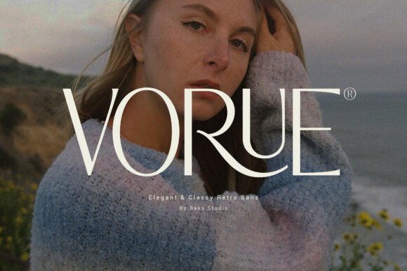
19. Vorue Font
Consider Vorue while comparing typography for a polished identity. Review the product preview and test the font with your actual brand name to assess its suitability.
Explore Vorue
20. Modern Luxury Font
Complete the collection with Modern Luxury. Preview the font in your chosen branding applications and review the available files and license before using it commercially.
Explore Modern LuxuryWhere to Use Luxury Fonts
A carefully selected typeface can help create a consistent look across different brand touchpoints. Here are several places where you can test your chosen font:
- Brand logos: Test the typeface with your business name and any accompanying symbol.
- Packaging: Preview how the font looks on labels, boxes, product tags, and other packaging materials.
- Websites: Use typography to establish a visual hierarchy for headings, navigation, and promotional content.
- Social media: Create a consistent look across posts, banners, announcements, and campaign graphics.
- Business stationery: Try the font on business cards, presentation covers, and branded documents.
- Editorial layouts: Consider how the typeface works in magazine-style compositions, lookbooks, and portfolios.
How to Choose a Font for Your Brand
1. Define your brand personality
Before choosing a font, decide how you want your brand to be perceived. Minimal, sophisticated, bold, playful, and contemporary identities may require different typographic approaches.
2. Check readability
A font may look appealing in a large preview but be harder to read at smaller sizes. Test it in headings, short labels, and any other places where your audience will need to read the text.
3. Consider font pairing
If you plan to use two fonts, make sure they complement each other rather than compete for attention. A clear hierarchy can make your brand materials easier to navigate.
4. Review the available characters
Check whether the font includes the letters, numbers, punctuation, and language support your project requires. This is especially important if your brand name or content uses characters beyond basic English.
5. Review the license
Font licenses can differ depending on the product and intended use. Read the current terms on the product page before using a font in commercial branding, client work, websites, or products for sale.
6. Test before committing
Create a simple mockup using your preferred font, colors, and brand name. Compare several options in the same layout so you can evaluate them on equal terms.
Frequently Asked Questions
What is a sans serif font?
A sans serif font is a typeface whose letters do not have the small finishing strokes called serifs. Sans serif typefaces are used in a wide range of applications, from logos and websites to packaging and editorial design.
What makes a font suitable for luxury branding?
Suitability depends on the brand’s personality, audience, and visual system. Letterforms, spacing, readability, and how the font works with other brand elements all influence the final impression.
Can I use these fonts for a business logo?
Check the license for each specific font before using it in a logo or other commercial work. The permitted uses may vary by product and license type.
How do I add font preview images to this article?
Replace PASTE-IMAGE-URL-HERE in each image tag with the direct URL of the corresponding preview image. Keep the quotation marks around the URL.
Should I use the same font everywhere in my branding?
Consistency is important, but a brand can use a small, coordinated type system. For example, one font may be used for headlines and another for supporting text, provided they work well together and remain readable.
Final Thoughts
Choosing typography is an important part of building an elegant brand identity. The 20 fonts in this collection give you a starting point for exploring different lettering styles and comparing options for logos, packaging, websites, and other creative projects.
Preview each font, test it with your brand name, and check the included characters, file formats, and license before making your final decision. The best choice is one that fits your brand and works consistently across the places your audience encounters it.
You may also like:
- 18 Elegant Premium Fonts for Fashion & Luxury Branding 2026
- 20 Premium Serif Fonts for Fashion Branding & Editorials
- 15 Elegant Luxury Fonts for Beauty Branding
- 16 Elegant Fonts for Luxury Clothing Labels 2026
- 10 Modern Script Fonts for Weddings, Branding & Creative Projects
- 12 Elegant Serif Fonts for Modern Editorial Layouts
- 13 Modern Script Fonts for Premium Product Labels 2026