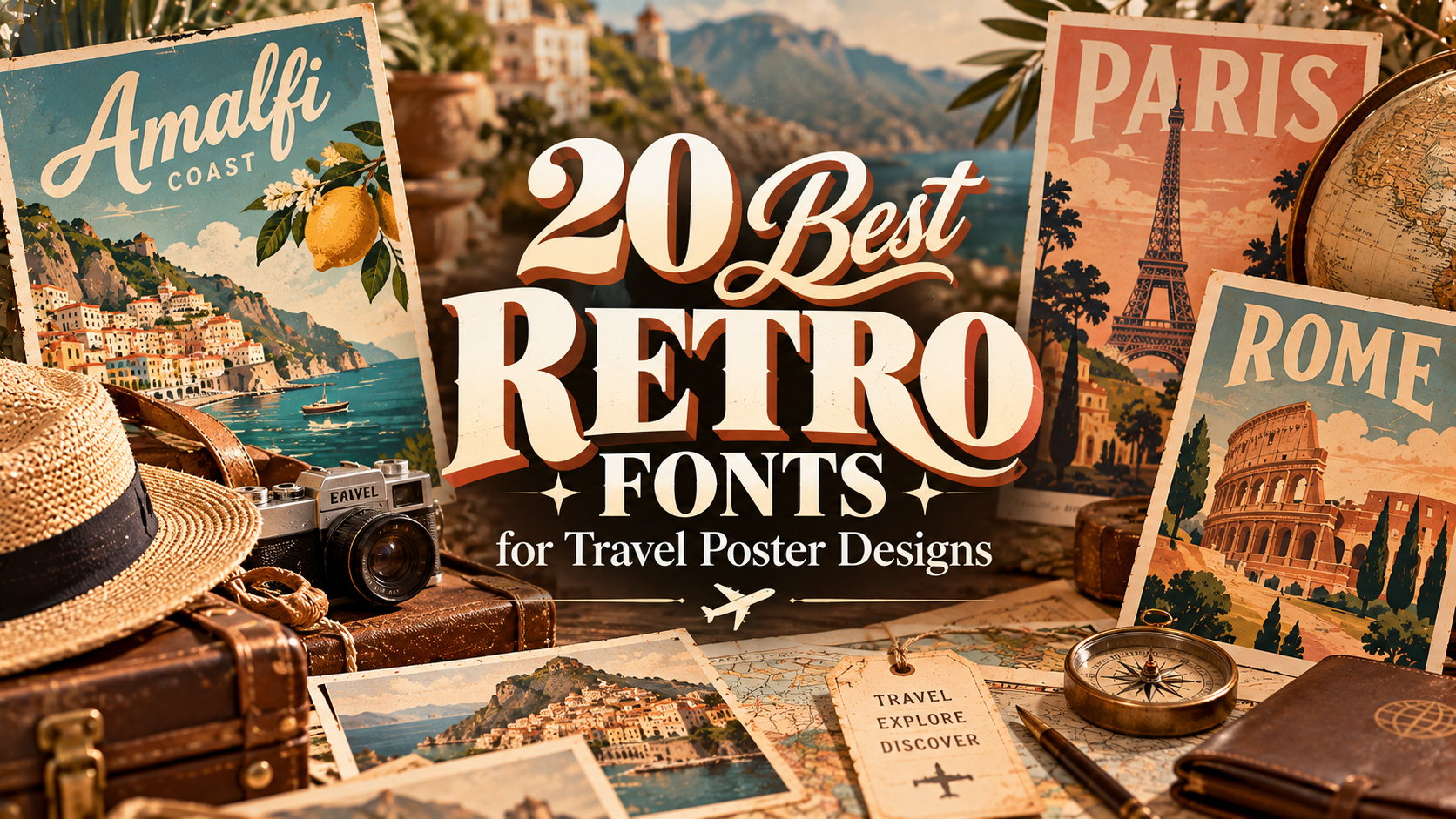
20 Best Retro Fonts for Travel Poster Designs
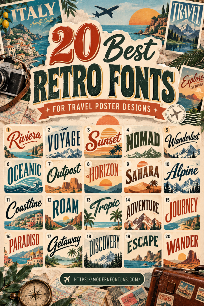
Retro travel posters have a special charm. Inspired by vintage tourism advertisements, classic postcards, and old-fashioned destination prints, these designs bring together nostalgic typography, beautiful scenery, and eye-catching colors.
Whether you’re creating artwork for a favorite vacation spot, designing printable wall art, promoting a travel destination, or making a nostalgic poster collection, choosing the right typeface can make a big difference. In this collection, you’ll discover 20 retro-inspired font options to explore for your next travel poster design.
20 Best Retro Fonts for Travel Poster Designs
Explore these fonts for destination names, poster headlines, decorative text, and supporting typography. Each option can bring a different personality to your composition, so experiment with your actual poster wording before making a final choice.

1. Swirlpuff
Consider Swirlpuff for a travel poster that needs a distinctive and expressive headline. It could be an interesting choice for colorful vacation artwork, playful destination prints, and creative travel-themed graphics.
View Swirlpuff
2. Savisco
Savisco is worth exploring for a vintage-inspired poster concept. Try it with destination names, travel slogans, or large headline text to see how it complements your chosen scenery and illustration style.
View Savisco
3. Vintage City
With a name that evokes classic urban destinations, Vintage City is a natural option to test for city-themed travel artwork. Consider it for posters featuring historic streets, famous landmarks, or nostalgic city scenes.
View Vintage City
4. Retro World
Explore Retro World for destination artwork with a nostalgic visual direction. It may be suitable for travel-inspired wall prints, vintage-style advertisements, and posters celebrating memorable places.
View Retro World
5. Color Momo
Color Momo is an option to experiment with when creating bright, cheerful travel graphics. Test it with bold color combinations and illustrated landscapes for a lively poster concept.
View Color Momo
6. Tropical
Tropical is a fitting option to consider for beach destinations, island getaways, and warm-weather travel posters. Pair it with palm tree illustrations, ocean scenes, or colorful sunset artwork.
View Tropical
7. Funky Daze
For a travel poster with a fun and unconventional personality, explore Funky Daze. It could be an interesting direction for festival destinations, colorful city breaks, or imaginative vacation artwork.
View Funky Daze
8. Classic Outline
Classic Outline is worth testing for poster headlines that need a decorative treatment. Explore it with large destination names and simple background illustrations to keep the overall composition balanced.
View Classic Outline
9. Popstix
Consider Popstix for a poster that needs a bold, attention-grabbing personality. It may work well for lively destination promotions, travel event artwork, and colorful retro-inspired compositions.
View Popstix
10. Groovy Whimsy
Groovy Whimsy is an option to explore for travel artwork with a playful nostalgic direction. Try it for road-trip posters, colorful vacation prints, and destination designs with a relaxed personality.
View Groovy Whimsy
11. Unfunk
Explore Unfunk if you want to experiment with a distinctive type treatment for your travel poster. It could be useful for expressive headlines and designs that move beyond a traditional tourism-poster layout.
View Unfunk
12. Slightly Surreal
For imaginative destination artwork, Slightly Surreal is a creative option to test. Consider it for unusual landscapes, dreamlike vacation scenes, and artistic posters inspired by faraway places.
View Slightly Surreal
13. Sunie Robti
Sunie Robti is another font to explore for a personalized travel poster concept. Test it with short destination names and supporting text to see how it fits your overall visual direction.
View Sunie Robti
14. Funky Grooves
Funky Grooves is worth considering for travel posters with a lively, nostalgic feel. Experiment with it for road-trip themes, resort promotions, or colorful destination illustrations.
View Funky Grooves
15. Retro Groovy
Retro Groovy is a natural candidate for posters inspired by vintage travel advertising and nostalgic pop culture. Try it with large headlines and scenic illustrations to create a cohesive retro composition.
View Retro Groovy
16. Gummy Bubbles
Consider Gummy Bubbles for cheerful travel graphics and playful destination artwork. It may suit family vacation posters, theme park promotions, and colorful illustrations.
View Gummy Bubbles
17. Matcha
Matcha is an option to explore for travel artwork inspired by nature, peaceful retreats, and scenic destinations. Test it alongside botanical illustrations, mountain landscapes, or minimalist poster layouts.
View Matcha
18. Doughie
Explore Doughie for a distinctive approach to travel poster typography. It could be an interesting choice for casual vacation themes, illustrated destinations, and creative souvenir designs.
View Doughie
19. Rocky Brown
Rocky Brown is worth testing for travel posters featuring outdoor adventures and scenic locations. Consider it for mountain escapes, countryside destinations, and road-trip-inspired artwork.
View Rocky Brown
20. Muffie
Muffie rounds out this collection with another creative option for vintage-inspired poster projects. Try it with destination names, travel captions, and illustrated scenery to see whether it suits your design.
View MuffieHow to Choose the Right Retro Font for a Travel Poster
Not every retro font will work for every destination or poster style. Before choosing a typeface, think about the atmosphere you want your design to communicate.
1. Match the Font to the Destination
Think about the place featured in your poster. A tropical beach destination may call for a relaxed and playful visual direction, while a historic city or mountain resort might benefit from a more classic or understated approach. Let the destination guide your typography choices.
2. Make the Destination Name Stand Out
The location is often the main focus of a travel poster. Choose a font that gives the destination name enough visual presence without making it difficult to read. Large headlines are especially useful for creating a strong focal point.
3. Consider the Era You Want to Evoke
Retro design can draw inspiration from many decades and visual movements. Decide whether your poster should feel like a classic tourism advertisement, a colorful mid-century print, or a playful vintage-inspired graphic. Keep the typography and other design elements consistent with that direction.
4. Combine Display and Supporting Fonts
A decorative font can work well for the main headline, while a simpler typeface can handle smaller details such as dates, captions, and location information. This contrast helps create a clear visual hierarchy.
5. Check Readability at Different Sizes
Travel posters are often viewed from a distance or displayed in different formats. Test your typography at full size and as a smaller preview. Make sure the destination name remains recognizable and the supporting information is easy to read.
Travel Poster Design Tips
Typography is only one part of a successful travel poster. These design ideas can help you create a more cohesive and memorable composition.
- Use destination-inspired colors: Draw inspiration from the location, such as ocean blues, warm sunset tones, forest greens, or earthy landscape colors.
- Choose a strong focal image: A recognizable landmark, scenic landscape, or illustrated local attraction can give the poster a clear subject.
- Keep the layout balanced: Give the headline, illustration, and supporting details enough room to breathe.
- Use texture thoughtfully: Subtle grain, faded effects, or paper-inspired textures can help create a vintage print atmosphere.
- Limit decorative elements: Avoid adding so many shapes, borders, and illustrations that the main destination becomes difficult to notice.
- Think about the final format: Check how the design looks as a digital graphic, a printable poster, or a framed wall-art piece.
- Maintain consistent typography: Use a clear hierarchy and avoid combining too many competing display fonts.
Frequently Asked Questions
What makes a font suitable for a retro travel poster?
A suitable font should support the nostalgic mood of the design while keeping the destination name readable. The best choice depends on the era, destination, illustration style, and overall personality of the poster.
What colors work well in retro travel poster designs?
Travel posters can use warm oranges, muted yellows, deep blues, greens, creams, and earthy shades. Choose colors that complement the destination and the visual style you’re trying to create.
Can I use more than one font in a travel poster?
Yes. A display font for the destination name and a simpler supporting font for captions or details can create a balanced design. Two complementary typefaces are often enough.
How do I make a travel poster look vintage?
Use a consistent retro-inspired color palette, destination-focused illustrations, thoughtful typography, and subtle print textures. A balanced layout can help bring all these elements together.
Can retro fonts be used for digital travel graphics?
Yes. Retro typography can work for social media graphics, travel blog illustrations, digital advertisements, website banners, and printable artwork. Always test the text at the size where people will view it.
Should I check the font license before using it commercially?
Yes. Always review the specific font license and usage terms before using a typeface in commercial posters, client projects, merchandise, or products for sale. Make sure your intended use is permitted.
Final Thoughts
Retro travel posters combine the excitement of discovering new places with the nostalgic appeal of classic graphic design. The right typography can help capture that feeling, whether you’re creating artwork for a tropical escape, a historic city, a scenic mountain destination, or a memorable road trip.
These 20 fonts provide plenty of options to explore for your next travel poster project. Experiment with different headline treatments, color palettes, and illustrations until you find a combination that captures the spirit of your destination.
Remember to keep your layout balanced, make the destination name easy to read, and choose typography that supports the overall mood. With a thoughtful approach, you can create travel posters that feel both timeless and distinctive.
Affiliate Disclosure: This article contains affiliate links. If you make a purchase through these links, we may earn a commission at no additional cost to you.
You may also like:
- 11 Best 70s Retro Fonts for Logos, Posters & Branding in 2026
- 19 Retro Display Fonts for Bold and Nostalgic Designs
- 21 Retro Fonts for Vintage Branding and Design
- 16 Classic Vintage Fonts with a Modern Twist
- 18 Summer Tropical Fonts for Party Event Flyers 2026
- 12 Retro & Modern Display Fonts for Designers