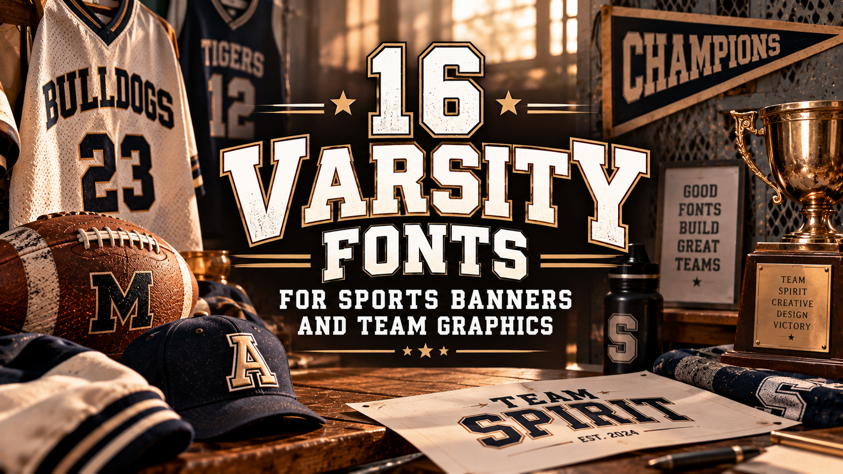
16 Varsity Fonts for Sports Banners and Team Graphics

The right sports font can give a design the energy, confidence, and personality it needs. From varsity-inspired lettering to distressed styles and bold display fonts, these 16 options offer creative starting points for team graphics, racing-inspired artwork, sports merchandise, posters, and custom apparel.
16 fonts · Team graphics · Apparel · BrandingSports typography needs to make an impact. Strong lettering helps team names stand out, gives merchandise a recognizable look, and makes promotional graphics easier to notice. The best choice depends on the mood of your project: classic and collegiate, rugged and vintage, or modern and high-energy.
Below is a curated list of 16 fonts to explore on Creative Fabrica. Preview each font and check its included characters, file formats, and license details before using it in your project.
16 Sports Fonts to Explore
Explore the styles below and consider how each one might work with your colors, layout, audience, and intended use. Product previews can help you evaluate the lettering before making a choice.

Reborn Varsity
Consider Reborn Varsity for collegiate-inspired graphics, team names, school spirit designs, and merchandise that calls for a traditional athletic look.
View Font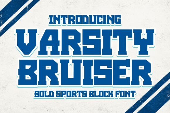
Varsity Bruiser
Explore this option for strong team graphics, sports-inspired slogans, and bold designs where the lettering needs to take center stage.
View Font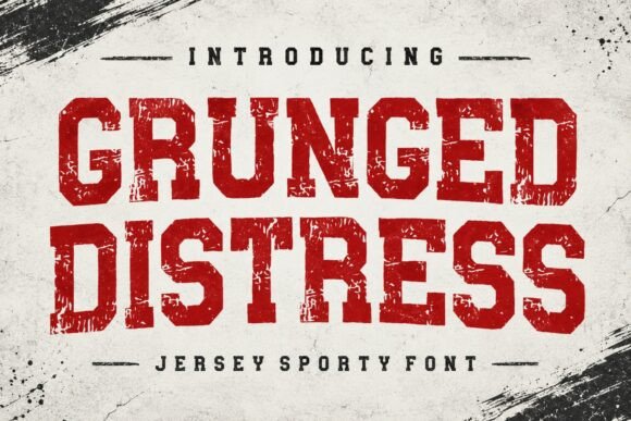
Grunged Distress
A distressed lettering direction can help create a worn-in aesthetic for vintage-inspired sports posters, apparel graphics, and energetic promotional artwork.
View Font
Rodeo Rustler
Consider this font for designs that mix sports themes with a western or rodeo-inspired concept, including event graphics, novelty apparel, and themed merchandise.
View Font
Rabbit
Preview Rabbit for projects where you want to explore a distinctive display style. Test it with short headlines, graphic accents, and merchandise lettering.
View Font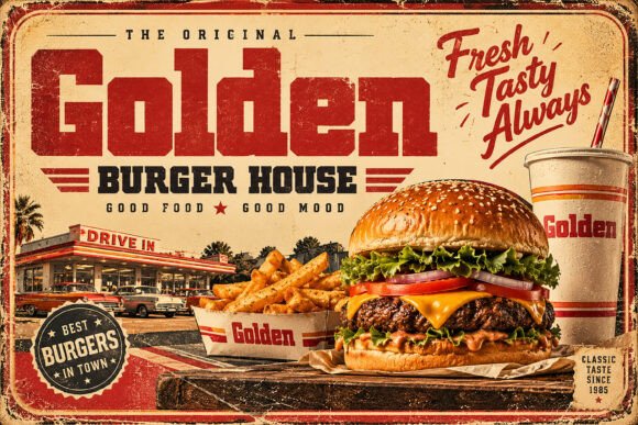
Golden
Try Golden in a range of sports-related layouts, from headline treatments to merchandise concepts. Review the product preview to see whether its character suits your design.
View Font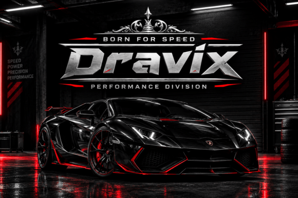
Dravix
Dravix is another option to evaluate for modern display typography. Test it in team graphics, event titles, or digital sports artwork before settling on a final layout.
View Font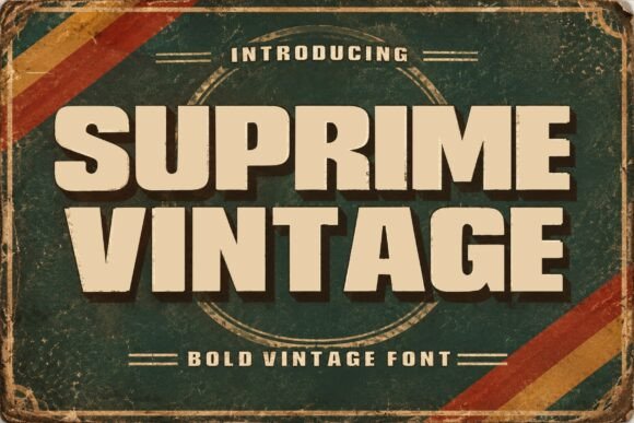
Suprime Vintage
Explore Suprime Vintage for retro-inspired sports graphics, throwback merchandise concepts, and designs that pair well with aged textures or classic color palettes.
View Font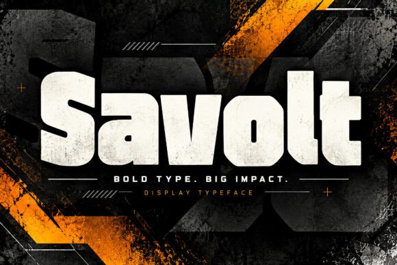
Savolt
Add Savolt to your shortlist when comparing display fonts for sports-themed projects. Check how its letterforms work in large headlines and smaller supporting text.
View Font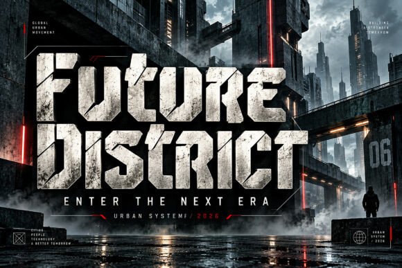
Hostron
Consider Hostron for display-focused compositions such as team announcements, sports event posters, and merchandise mockups. Preview the font before deciding on its role.
View Font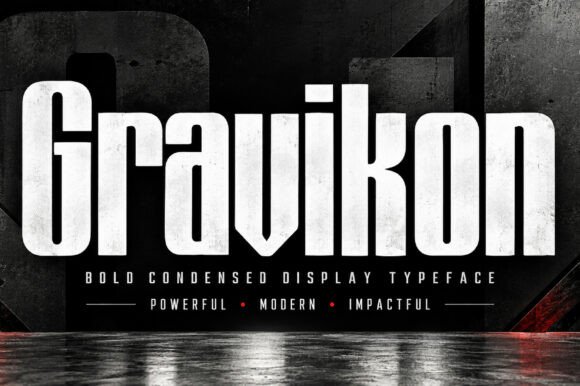
Gravikon
Compare Gravikon with other display options for bold titles, promotional graphics, and sports-themed merchandise. A quick test layout can help you judge readability and balance.
View Font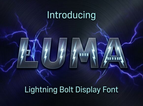
Luma
Explore Luma for sports-related design experiments, including headline graphics, apparel concepts, and digital promotional assets. Check the available glyphs and styles on its product page.
View Font
Blockstrike
Try Blockstrike in short, high-impact headlines and team-centered layouts. Make sure the text remains clear at the size and distance where your design will be viewed.
View Font
Altzon
Add Altzon to your comparison list for sports posters, team graphics, and other display-led projects. Pair the lettering with a restrained layout to keep the message easy to follow.
View Font
Chunko
Preview Chunko for projects that need a noticeable display typeface. Test short phrases and check the overall balance before using it across a full merchandise collection.
View Font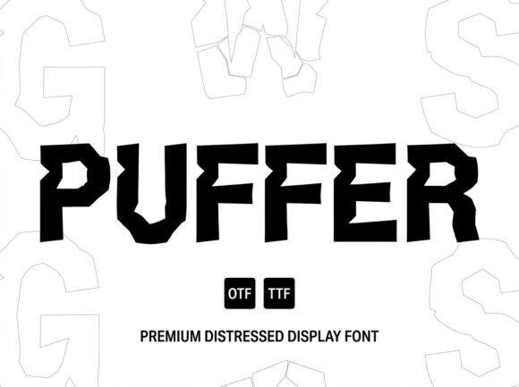
Puffer
Round out your shortlist with Puffer. Explore its preview and see whether the lettering complements your concept, especially when creating distinctive graphics or apparel designs.
View FontHow to Choose a Sports Font
A font should support the purpose of your design rather than compete with it. Before choosing one, consider the following points.
1. Match the font to the concept
Varsity-inspired lettering can suit collegiate and team themes, while distressed typography may be a better fit for vintage or rugged artwork. For racing-inspired graphics, test the font alongside the other visual elements to see whether the complete design feels cohesive.
2. Prioritize readability
Team names and short slogans should remain legible at their intended size. Preview the text at different scales, and avoid crowding letters with excessive outlines, effects, or decorative elements.
3. Check available characters and files
If your design includes numbers, punctuation, accented characters, or multiple languages, confirm that the font supports the characters you need. Review the included file formats and installation instructions on the product page.
4. Consider the final product
Typography for a digital poster may need different adjustments from lettering prepared for a shirt, cap, sticker, or other physical item. Test the design at its intended size and check the requirements of your printing or production method.
Where to Use Sports Fonts
- Team graphics: Create visual treatments for team names, player numbers, and fan artwork.
- Racing-inspired designs: Build posters, event graphics, and motorsport-themed creative concepts.
- Merchandise: Develop concepts for T-shirts, hoodies, caps, and other products, subject to the font’s license.
- Promotional materials: Design banners, social posts, announcements, and event flyers.
- Personal projects: Experiment with sports-themed invitations, labels, stickers, and digital artwork.
Always review the license terms for the specific font before using it commercially. If you plan to sell finished products, confirm that your intended use is permitted.
Frequently Asked Questions
What makes a font suitable for sports designs?
A useful sports display font should fit the project’s visual style and keep key wording readable. The right choice depends on the design, its audience, and where the lettering will appear.
Can I use these fonts for team merchandise?
Potentially, but permitted use depends on each font’s license. Check the specific product terms before creating or selling merchandise.
How many fonts should I use in one sports design?
One display font and one complementary font are often enough. Limiting the number of typefaces helps maintain a clear hierarchy and makes the main message easier to recognize.
What should I check before downloading a font?
Review the font preview, included characters, file formats, installation instructions, and license. Make sure the files and terms match your design software and intended use.
How can I make sports lettering stand out?
Use strong contrast, deliberate spacing, and a clear layout. Outlines or shadows can help in some designs, but test them carefully so they do not reduce readability.
You may also like: